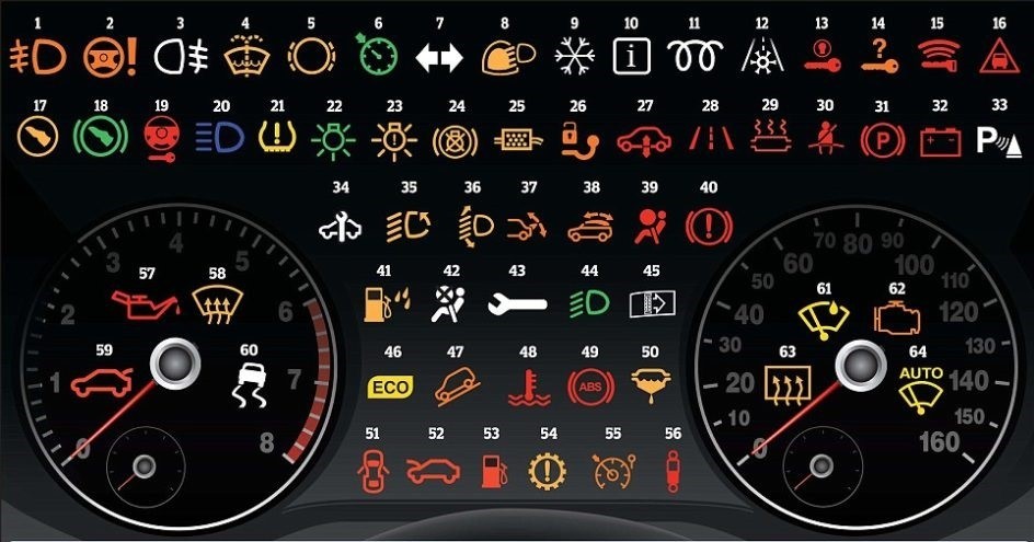
A few years ago, one of Europe’s largest car insurance company did a survey of the dashboards in the 15 best-selling cars.
The survey identified 99 different dashboard indicators. How many of the 99 indicators are the same in all 15 cars? The answer surprises most people – only 12 indicators are the same.
Then, the insurance company did more research with its customers – car drivers.
First, they looked at the most basic warning lights, e.g. engine, oil, battery. They asked drivers to explain what the warning lights mean. Just under half of all drivers (46%) did not know what the basic warning lights mean.
Second, when that 46% had problems with the car, they continued driving with the warning lights on for 12 days (on average), which doubled their car repair costs. That, of course, multiplied the costs for the car insurance company.
Ignorance hits costs, local customer satisfaction and product quality
Ignorance increases costs. In this case: repair costs. Clearly too many drivers do not understand the key indicators. Perhaps the car manufacturers are giving us too much data.
More to the point, do all these indicators improve drivers’ decision-making capability? This research suggests it doesn’t.
There’s the lesson for global managers. Don’t get distracted by over-emphasising the key success indicators. And don’t let team members on change projects waste time coming up with fancy data dashboards.
Because underperformers – like those drivers – either have too much data or don’t understand what the data shows. And it’s more frequent than you think.
Plus, if the person at the top doesn’t know the limitations of the data, then the people they lead in other countries understand them less. Everyone confuses everyone else in a fog of confusion.
Without clarity, collaboration suffers. And poor collaboration across global business units means poor product quality and bad customer service.
Three types of indicators
The best global companies know the strengths and limitations of their indicators. They educate all of their managers about the different types of indcators:
Type 1: Tangible Indicators – these easy to measure.
Examples are the number of units produced per shift (in production), bank account balances (in finance), inventory delivery times (in supply chain) and number of users logged-in (in IT).
Type 2 – Intangible Indicators – these are harder to measure
They include brand awareness or brand loyalty (in marketing). The level of subjectivity increases.
Type 3 – Composite Indicators – these are multiple indicators which together measure one outcome.
Ask people what makes them happy: money, friends, job security, health. The core answers are the same. Although no single indicator explains happiness completely, a composite of indicators explains about 80% of what makes somebody happy.
A shared understanding of local indicators and the rationale
Most importantly, the clever companies get local managers and local functions involved in the selection of Type 3 indicators.
Change processes are all about implementing new, better behaviours. By involving local managers, you make sure everyone understands not only the key success indicators, but also the business rationale behind selecting the indicators.
When that happens, trust, honest performance feedback, and collaboration naturally increase. Motivation and engagement also increase. And because the indicators tend to be used more consistently and accurately, decision-making is better and faster.
In short, these global managers become part of the “56%” who know what their indicators mean and can confidently, competently steer change.